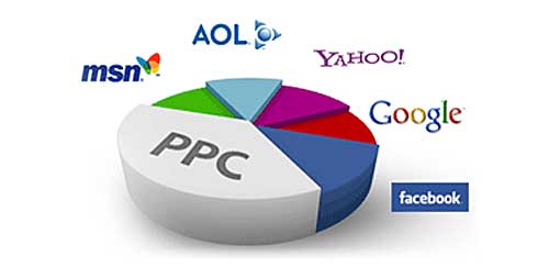
 The intent of PPC (Pay Per Click) marketing campaigns for vocational schools is to capture the lead so your admissions team can then get them into the school for an appointment.
That’s it.
Pay Per Click can be your highest unit cost referral source, so you don’t want to waste it on email lists. If at first you don’t succeed scheduling an appointment, then have your admission funnel move them into alternate paths like free email courses or online seminars. PPC advertising for schools has one goal: collect their contact information and get an admissions representative to contact them as quickly as is possible (within minutes is preferable).
Given that goal, optimized landing pages that encourage the person who clicked on the ad are a very important part of any good online marketing strategy. What’s the point of paying to get visitors if they don’t contact you or request information? If they don’t submit their information, you just wasted money on the click.
Never have your ads click to you school’s home page. Your home page might be the one you spend the most time designing, but it’s also probably not even remotely designed to capture a lead. There are companies that make millions of dollars annually just designing effective landing pages. It is a science as much as an art, and you can make a good one with just a little research. Search Google images for “great landing page designs” and you’ll be presented with countless examples.
Every time you start an online PPC campaign remind yourself that the landing page is more important than the ad. The ad finds the prospective lead, the landing page converts it to a real lead that your admissions team can contact.
Match your ad groups to your landing pages.
The text in your ads should reflect the text in your landing pages. This helps you on both ends of the process: you get a better ad quality score, and the person who clicks on the ad feels like they “got what they clicked for” and so will be more likely to engage the page.
Even if you have only one program of instruction: make multiple landing pages so you can test how well each converts and act on the resulting research. Sometimes a simple change like a photo swap, or moving a form slightly higher on the page can make a large difference.
And never forget about mobile ads. Mobile PPC clicks normally cost less per click than desktop/laptop – because they don’t convert as well – but you can take advantage of that format if you take the time to put a decent system in place. For example: have a mobile-only PPC campaigns, so those ads click to a unique landing page with a shorter, more mobile-friendly inquiry form. Make sure the image size is reduced and the column layout organized to be easier to navigate with taps instead of mouse clicks.
Good landing pages should have a clear call to action, be straight forward, to the point, and have purpose – including an offer is even better: download a free brochure, we’ll send you our booklet: 10 Tips To Be A Rockstar, etc. Whatever you can do to entice the person to engage: try it.


